
Colour theory in cooking offers significant insights into how visual elements can enhance the culinary experience. By understanding the psychological effects of different colours, one can create dishes that not only taste good but also engage the senses and elevate enjoyment. The way food is presented can influence perceptions of flavour and quality, making colour choices critical in both home cooking and professional kitchens.
The impact of colour extends beyond aesthetics; it plays a vital role in health and nutrition. Different colours are often associated with specific nutrients, suggesting that a vibrant, varied plate can contribute to a balanced diet. Chefs and home cooks alike can use colour to communicate freshness and appeal, which may also affect guests’ appetites and satisfaction.
By incorporating colour theory into cooking, individuals can transform simple meals into visually stunning culinary creations. This knowledge not only enriches the dining experience but also empowers cooks to explore flavour combinations that align with their colourful dishes.
Fundamentals of Colour Theory in Cooking
Colour theory plays a significant role in culinary arts, influencing not only presentation but also perception and taste. Understanding how colours interact can enhance food appeal and guide flavour combinations.
The Colour Wheel in Culinary Applications
The colour wheel is a useful tool in cooking that illustrates the relationship between different colours. It is typically divided into primary, secondary, and tertiary colours, providing a framework for food presentation.
Chefs can create visually appealing dishes by choosing complementary colours. For instance, pairing green herbs with red tomatoes or yellow peppers can enhance the overall appearance of a dish. Contrasting colours add interest and can stimulate appetite, making colour selection crucial for enticing dishes.
Primary Colours and Food Pairings
Primary colours—red, yellow, and blue—are fundamental in cooking for crafting appealing colour combinations. Red often signifies ripe fruits or hearty meats, while yellow can represent grains and fresh vegetables. Blue is less common in natural foods but can be represented by ingredients like blue corn or certain cheeses. A thoughtful combination of these primary colours can elevate a dish’s visual and flavour profile.
Food pairing strategies can leverage these primary colours. For example, a salad with red tomatoes, yellow corn, and dark leafy greens not only looks vibrant but also ensures a range of textures and flavours.
Understanding Hues and Shades in Dishes
Hues and shades significantly impact the visual appeal of culinary creations. A hue refers to a specific colour, while a shade is created by adding black, altering the original colour’s brightness and intensity.
In cooking, various shades can evoke different feelings. Darker shades, such as deep purple eggplant or charred meats, can suggest richness and complexity. Conversely, lighter shades, like pastel salad greens, convey freshness and simplicity.
Chefs often play with hues to achieve balance in dishes. A plate with various hues creates depth, drawing the diner’s eye and enhancing the dining experience. Highlights, such as a drizzle of sauce in a contrasting hue, can emphasise certain elements, making each component stand out.
Natural and Artificial Sources of Food Colour
Food colour plays a significant role in food presentation and can influence taste perceptions. Both natural and artificial sources are available, each offering unique characteristics and applications in cooking.
Natural Colourants from Vegetables and Fruits
Natural colourants derived from vegetables and fruits come from various pigments. For example, chlorophyll provides a green hue, commonly found in spinach and other leafy greens. Beta-carotene, which gives an orange shade, is primarily sourced from carrots and sweet potatoes.
Lycopene, responsible for a red colour, is prevalent in tomatoes and certain red fruits, adding both colour and health benefits. Anthocyanins provide purple and blue tones, found in blueberries and red cabbage. These natural colourants not only enhance aesthetics but may also offer nutritional advantages.
Role of Spices and Herbs in Colouring
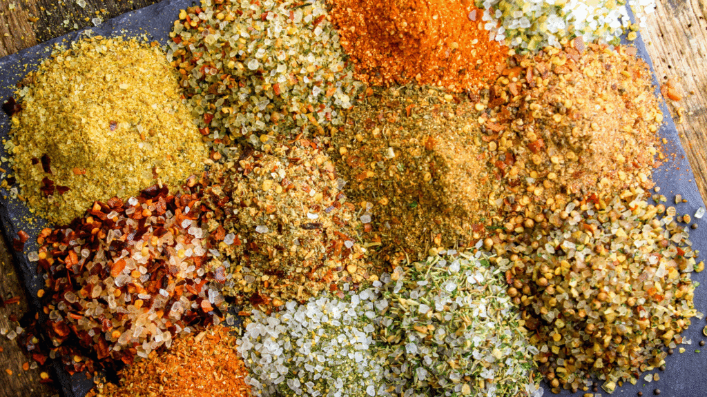
Spices and herbs significantly contribute to the colour of various dishes. Turmeric, containing curcumin, imparts a vibrant yellow colour, often used in curries and rice dishes. Ginger can add a light yellow tint alongside its distinct flavour.
In addition, herbs like basil and mint can provide subtle green shades, while dried chili can impart red tones. These ingredients enhance visual appeal and bring unique flavours, making them essential for colourful, enticing meals.
Utilising Artificial Food Colourings
Artificial food colourings are synthetic dyes used to achieve vibrant colours that might not be available through natural sources. E102 (tartrazine) adds a bright yellow color and is often used in drinks and confections.
Other common artificial colours include E129 (allura red) for red and E133 (brilliant blue) for blue shades. These colours are versatile and often used in processed foods, sweets, and beverages. While they provide consistent results, some consumers prefer natural options due to health considerations.
Practical Uses of Colour in Culinary Presentation
The use of colour in culinary presentation plays a crucial role in engaging the senses. It not only enhances the visual appeal of dishes but also influences perceived taste and appetite.
Enhancing Visual Appeal with Warm and Cool Colours
Warm colours like red, yellow, and orange can stimulate appetite and evoke feelings of warmth and comfort. For example, a plate featuring roasted red peppers and vibrant yellow corn can create an inviting experience.
Conversely, cool colours such as blue and green can provide calming effects, often associated with freshness. A salad garnished with shades of green, like forest green spinach and bright green herbs, promotes a sense of healthiness and lightness. Careful balance between warm and cool colours can create depth on the plate, making dishes visually striking.
Creating Signature Dishes with Unique Hues
Utilising unique colours can define a chef’s signature dishes. For instance, dishes incorporating purple ingredients, like beetroot or purple carrots, can stand out on a menu. These vivid hues not only attract attention but also spark curiosity.
Incorporating gold or silver elements, such as edible gold leaf or silver foil, can elevate a dish’s sophistication and visual interest. These touches often indicate luxury, making the meal feel exceptional. Using contrasting colours, like a rich blue sauce against a bright yellow plate, can create memorable presentations that leave lasting impressions on diners.
Pairing Colours for Balanced Plates
Pairing colours effectively enhances the aesthetic balance of a dish. Complementary colour schemes, such as red and green, can create harmony. For example, pomegranate seeds sprinkled over a green salad can highlight both colours.
It’s vital to consider the proportions of each colour. Too much of a single shade can overwhelm the dish. Creating a balance between different shades can ensure a more appealing plate. Incorporation of neutral elements, like white or black, can punctuate vibrant colours, allowing them to shine. This technique helps achieve an elegant and appetising presentation that engages diners’ interests.